Portfolio engagement
x62%
Share of visitors who go on from the home page to view at least one case study. This number wasn't tracked before — the portfolio lived on Behance with no analytics. Now it's the first step of the funnel.
[ About the project ]
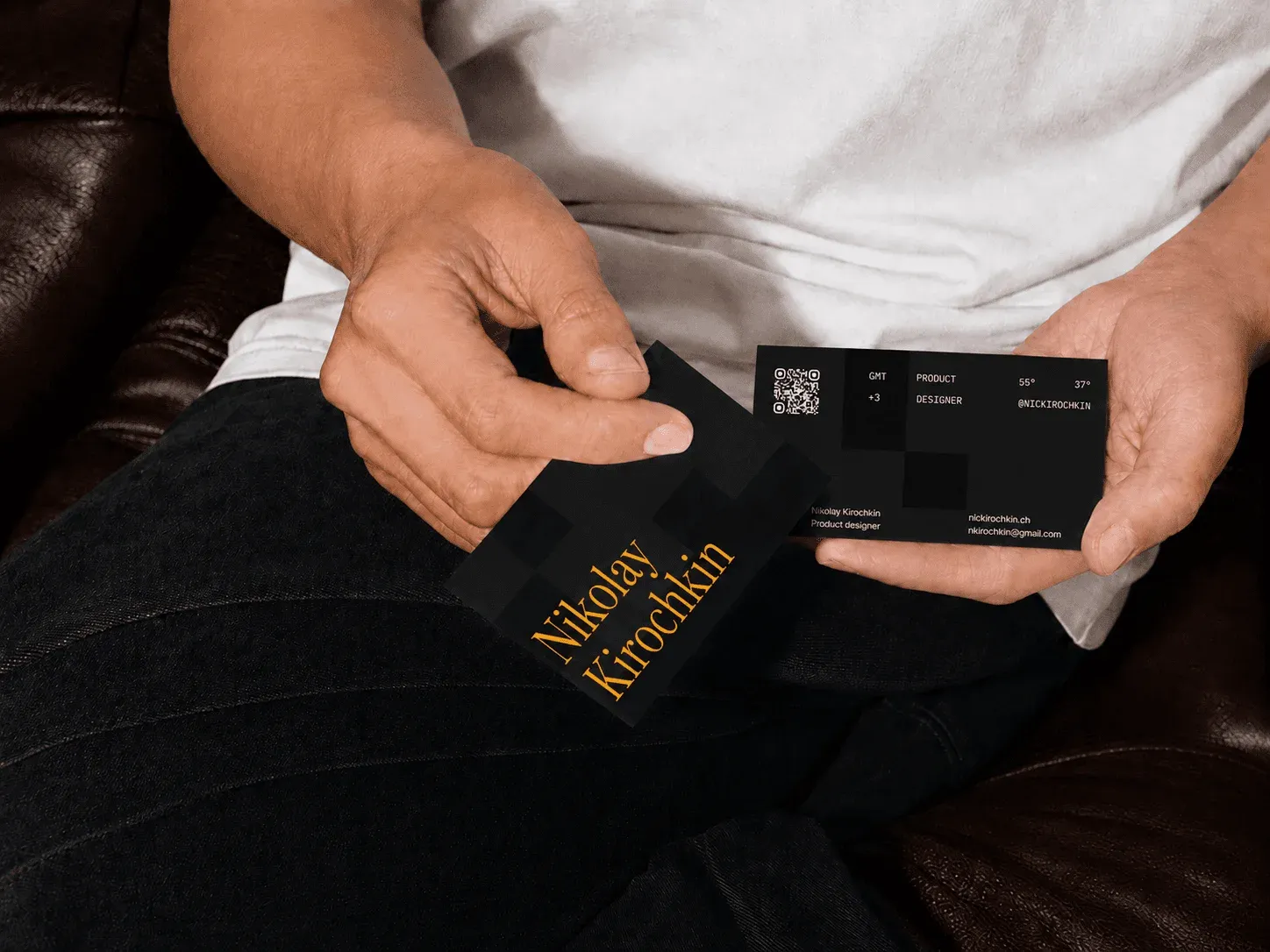
I'm a product designer, and at some point I noticed that my portfolio and social media didn't reflect my level — everything was too scattered. I decided to put it in order: identity, positioning, portfolio and website.
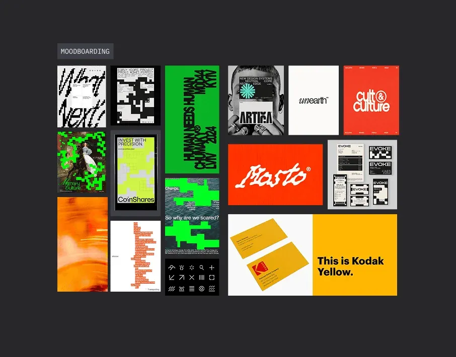
What took the longest wasn’t the visuals but figuring out how I want to come across. I tried several directions and settled on a dev style — clean, strict design focused on animation and detail, with no extra decoration. For the accent color I chose Kodak Yellow.
On that basis I made:

In parallel I worked out my positioning — what exactly I do and for whom. The audience turned out to be broad: clients, HR, agencies, other designers — each group has its own way of browsing, and it’s important to cover everyone’s needs without lowering the quality of presentation.
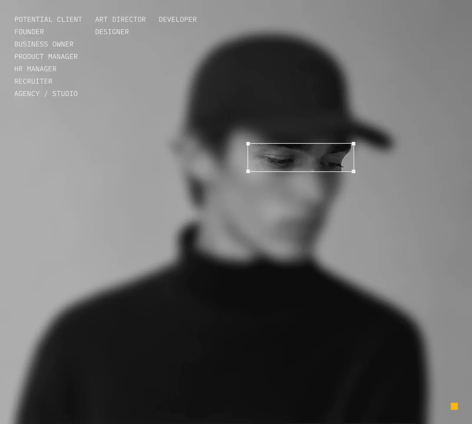
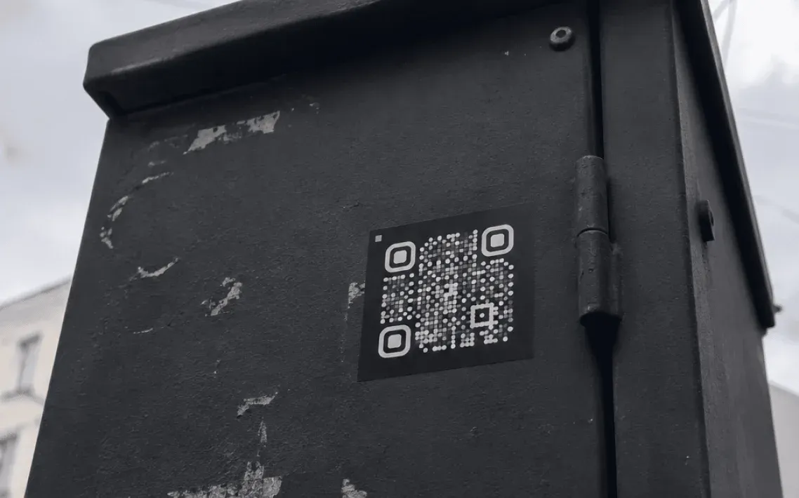
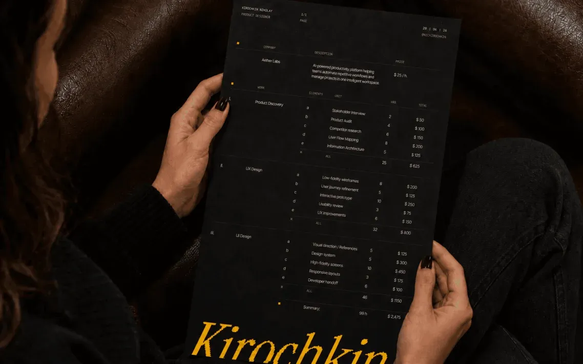
I’d been meaning to build the website for a long time and kept putting it off. This time I started not with the interface but with the goals: how to serve everyone I identified during positioning with a single site, without compromising the presentation for any group.
The home page is a short digest: who I am, the latest work of the year, areas of expertise, stack.
I made two ways to display case studies: a card grid — a minimal option for clients that gives a quick visual impression; and a list with tags — for HR and product teams who need to grasp what a case is about in seconds, without opening it.
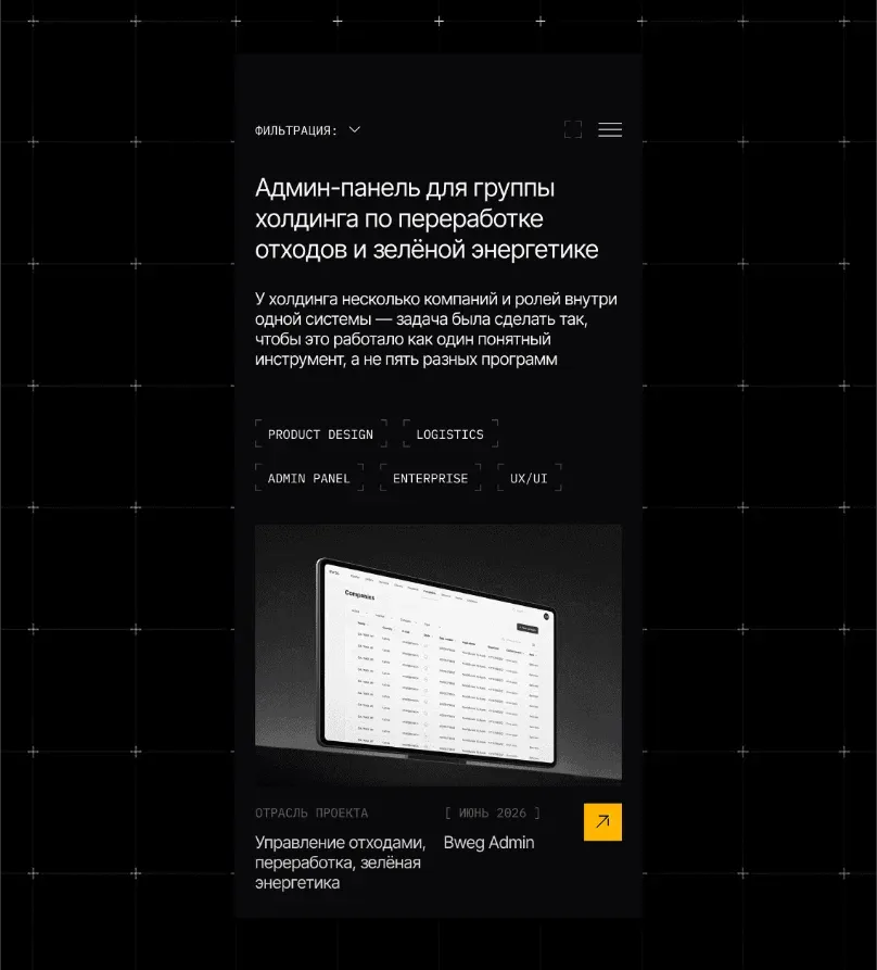
I also unified the structure of the case study page itself. Every project now opens with a standard context block — role, tags, industry, date — so within a couple of seconds it’s clear what the project is and how involved I was. I added a metrics block where there are metrics, and put the emphasis on visuals: large screenshots and breakdowns of specific decisions instead of a wall of text.
Separately I made a CV page: hard and soft skills, relevant work, contacts. I plan to personalize the hero block for a specific company when sending it directly — so the resume doesn’t look like a template.
Contacts have their own page. The 404 isn’t a dead end: it suggests checking out the latest case study.
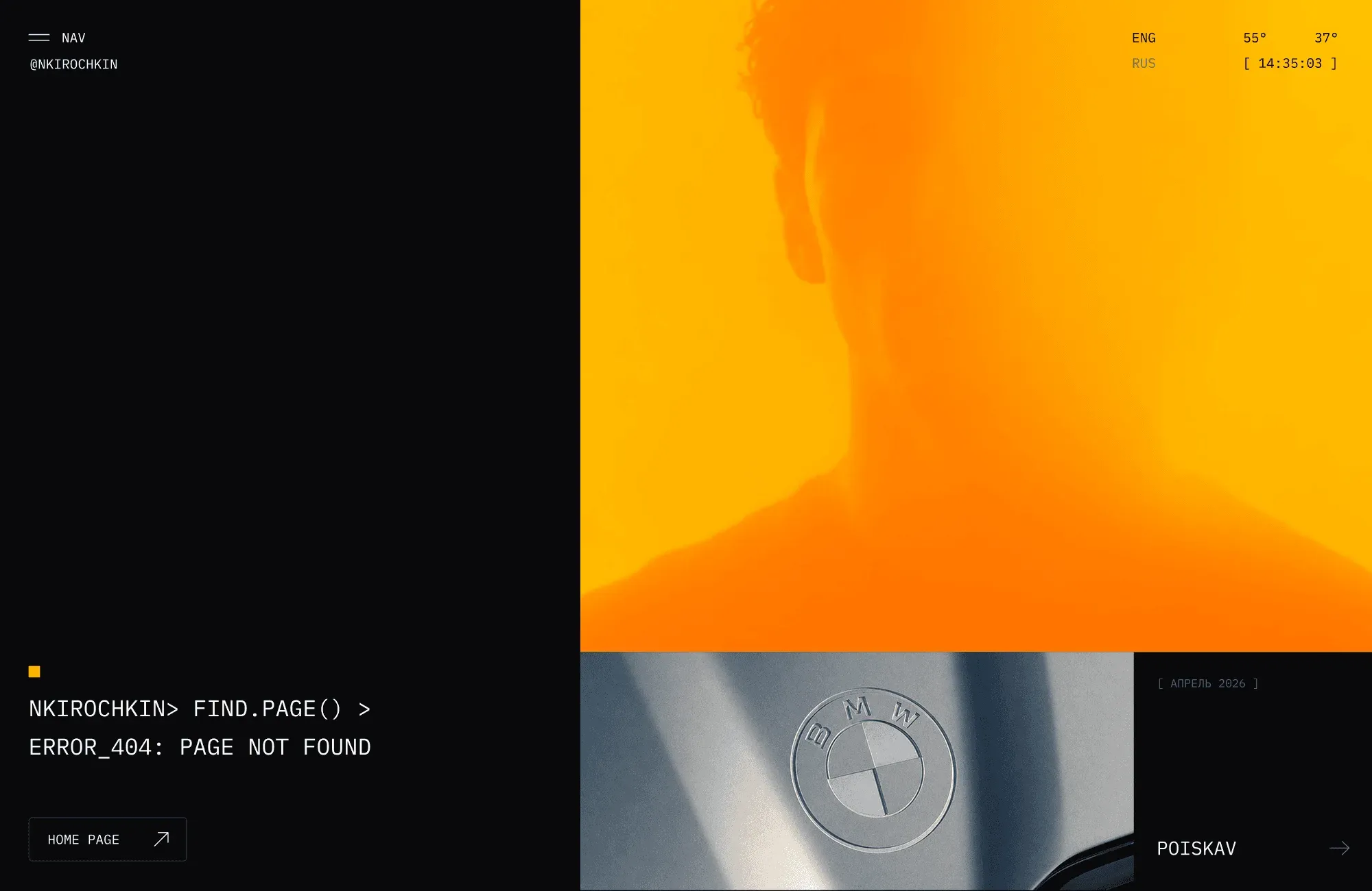
I built it myself in Framer. The main focus is on animation and micro-interactions: they’re in the project cards, in page transitions, even in the case filters. Custom animation and interaction solutions were put together with Claude. Some of the graphics were made with neural networks. I also built a stylish preloader, responsive layouts and the RU / EN switch.
My personal brand stopped being a collection of scattered files and became a system where every element supports the rest — the site speaks the right language to whoever lands on it. A month after launch and the first traffic, I measured the three metrics that matter most to me.
x62%
~0.6%7.4%
2 / mo.6 / mo.